
As the definition of event success has evolved, so have the tools used to measure and evaluate it. We’re delighted to announce the final of our exciting new “Sweap 3” features – our brand-spanking new Insights Panel.
The Case for Event Insights
Data is now the primary driver of the events industry. Gone are the days when loose claims of leads and attendee satisfaction were sufficient measures of event success. Instead, event professionals are expected to show how and why their events are successful via data analysis and evaluation.
Data literacy in the industry is improving. Yet few business leaders have the time to dive deep into complex pools of data when trying to determine event success. Our Event Efficiency Platform’s new Insights Panel automatically breaks down complex event data in real-time – presenting it in a range of helpful, easy-to-understand graphs and graphics.
The insights provided have a range of practical business use-cases. These include though are not limited to:
Demonstrating event success to supervisors and CEOs. With the click of a button, the Insights Panel can be exported to PDF or printed as an attractive colourful snapshot to bring to a meeting.
Real-time analyses and/or post-event comparative analyses of what’s working and what isn’t. For example, switching email tone and strategy if you’re not hitting your registration targets.
Planning for future events based on proven areas of weakness or strength. Decide what to replicate and what to re-examine; constantly learn and optimise.
The Insights Panel in Action
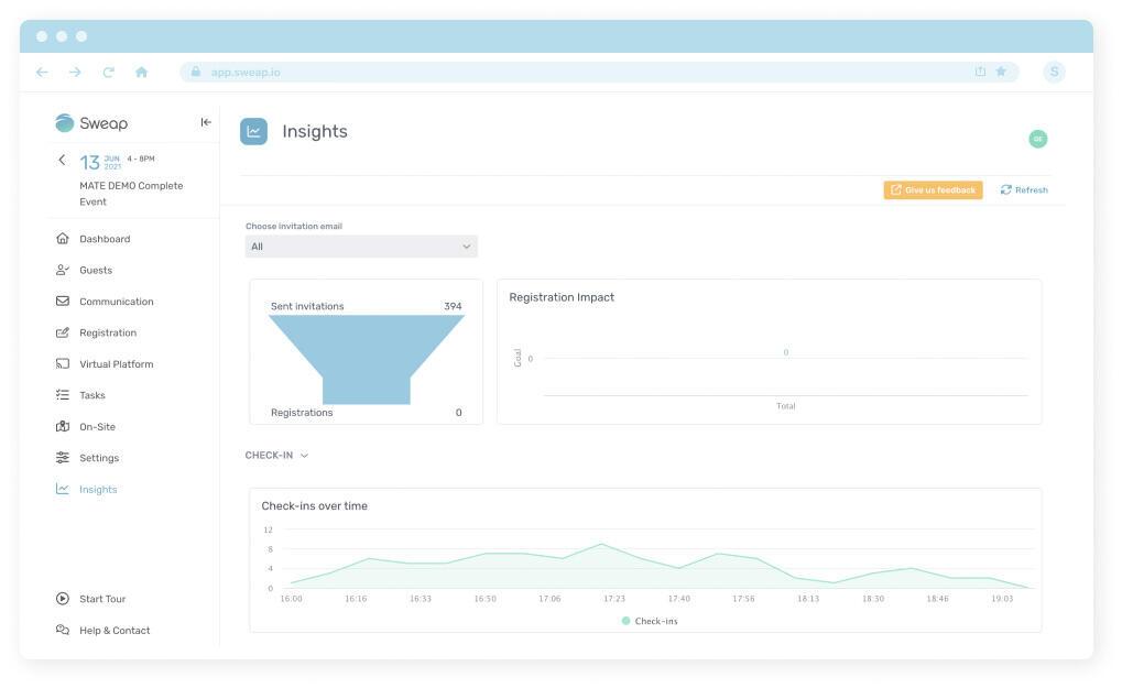
The Insights Panel is fit for in-person, hybrid, or virtual events. The insights it provides are broken down into the categories of Registration, Communication, and Check-in.
For a helpful guide to our new Insights Panel in action, here’s Nico with a video explainer[ASL1] . If there’s anything you’re unsure about, just read on below for a breakdown of its capability and functionality.
Registration:
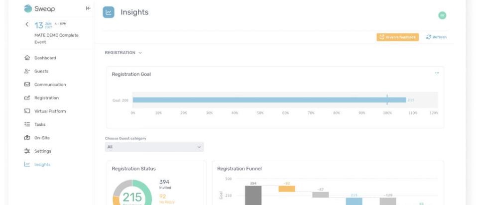
Following a simple graphic visualising your progress towards your registration goal, you will be presented with four further graphics.
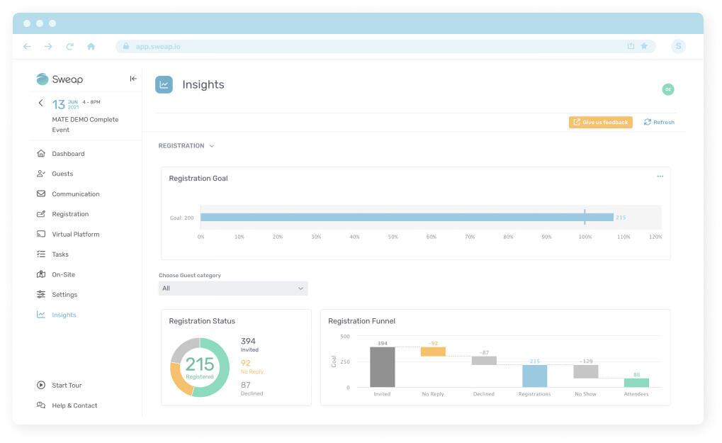
The first of these, “Registration Status” (shown on the left, below), is a simple pie-chart dividing invitees by whether they registered, declined, or failed to reply. The second graphic (on the right, below) dives into more detail by presenting attendee status in a bar-chart style “Registration Funnel” – it’s often not enough to know who came and who didn’t; by comparing stats like formal “declines”, “no replies”, and “no shows” instead, event professionals garner useful insights into where, why, and when they’re haemorrhaging potential attendees.
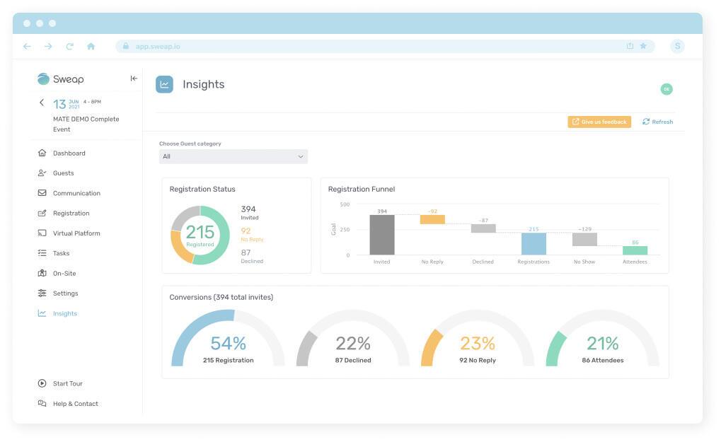
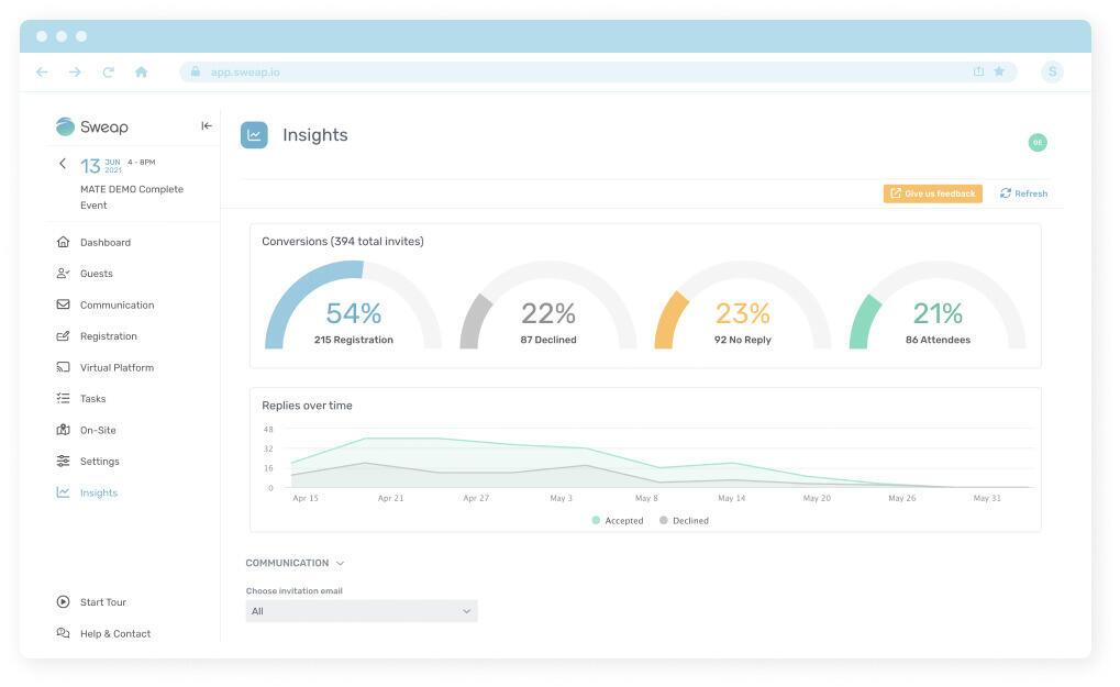
The next graphic, “Conversions”, breaks down attendees into percentages based on their conversion status. And the final graph of this section, a line graph entitled “Replies Over Time”, shows when in your timeline invitees chose to accept or decline the invitation. This last graphic is especially useful when measuring other event marketing efforts, do the accepted invitation spikes correlate with your targeted advertising pushes? If not, why not?
The real magic of this section comes in the dropdown box “Choose Guest Category” near the top. Rather than simply measuring all invitees, users can choose to select individual attendee categories. These could be speakers, VIPs, journalists, or whatever other custom category was inputted during the event creation stage. Simply select your category and the graphics will automatically readjust.
Communication:
The second section displays just two graphics, though their helpfulness should not be undervalued. Both of the graphics, the funnel and the “Registration Impact” graph, visualise the effectiveness of your email communications. Once more, by using the drop-down menu, these graphics can delve into more detail by analysing each of your emails individually.
Our Event Creation feature can now automatically create a dozen different email templates for your event, ranging from Early Bird Invitations to Reminder Emails to Final Calls. By tracking the CTR from any of those emails (or your own bespoke emails) and laying them out in the graphics below, you can determine which emails were the most or least impactful.
Check-in:
The final section displays information about check-ins via four distinct graphics. Between them, these graphics display ratios between those checked-in and not checked-in, as well as the Attendance Rate and No-show Rate. All of which are useful stats to have to hand both during an event and afterwards.
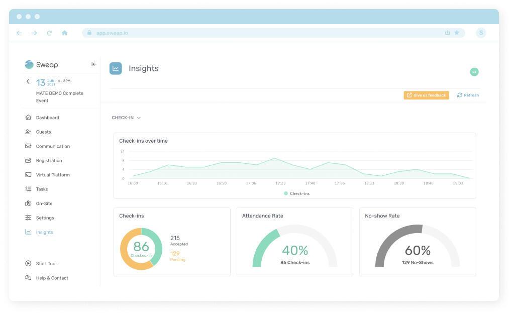
Arguably the most useful, however, is the line graph showing when exactly attendees have checked in. This vital information goes beyond who is late and who is early, it can be used for repeat events to show whether entry times need to be staggered or whether the attendee journey could be improved by longer entry times.
Export:
Your event is over and was a huge success. What now? Right - the export function gives you a beautifully designed PDF file that can be used for reporting purposes or to easily compare your event performance with previous events.
Feeling Insightful?
Event managers, event marketers, and event professionals of all kinds can benefit from these snapshot statistics. Impact measurement and event success measurement will only grow more important and precise in the coming years. Whether an event has been a success or whether it had significant areas for improvement, it’s absolutely vital to understand why.
With generous free trials available, you have nothing to lose by trying out our Event Efficiency Platform and its new Insights feature.
At Sweap, we’re determined to be the very best at what we do. We’ll continue to update our Insights feature over time, offering even more functionality, precision, and areas for customisation. If there are any features you would like us to add, simply hit the “Give us feedback” button found on every page.